My Game UI Feels Disconnected from the World Art – Help!
It’s a scenario many game developers and indie studios have faced at some point: your game world art is stunning, immersive, and rich in detail, but your user interface feels like it was designed for a completely different experience. Buttons look off, menus clash with backgrounds, and the typography doesn’t quite speak the same visual language as your game’s environment. The result? A jarring break in player immersion that can pull users out of the carefully crafted world you’ve built.
As someone who’s long been interested in how UI and world art intersect—always noticing fonts and icon sets before the gameplay begins—I understand the struggle to create a cohesive visual ecosystem. This post will walk you through practical strategies to ensure your game’s UI and world art feel interconnected, not like two separate projects shoehorned together.
Why Consistent UI and World Art Matter
Consistent UI and world art do more than just look pretty together; they work as a narrative device that enhances storytelling through design. When your menus, icons, and typography echo the world your players explore, you create what I call "fast storytelling": familiarity and immersion at a glance. Players can immediately understand mood, tone, and setting without deciphering cues or suffering dissonance between game elements.
Consider MrQ Casino Online: their interface effortlessly aligns with the thematic motifs of classic casino aesthetics — from card suits to neon signage. This kind of integration is what you want in your own game; your UI should feel like an organic extension of your world.
Familiar Settings as Fast Storytelling
When designing UI, one useful approach is rooting your visual system in familiar cultural or environmental settings. A game set in an ancient civilization? Lean on historical visual tropes that instantly signify time and place. For example, Ancient Egypt is a goldmine of reusable iconography—hieroglyphic styles, papyrus textures, gold-and-turquoise color palettes, and geometric patterns. These icons serve as functional art while driving thematic coherence.
Ancient Egypt as a Reusable Icon Set
- Hieroglyphic Buttons: Use stylized glyphs instead of generic arrow icons or standard UI symbols.
- Material Textures: Integrate stone, papyrus, or gold leaf textures subtly within button backgrounds or menu panels.
- Typography Matching: Choose fonts inspired by carved or scripted textforms, but ensure they maintain legibility and UI clarity.
This approach doesn’t just look cool—it tells users, "You are in an Ancient Egyptian world," before the gameplay even begins. The Victoria and Albert Museum (V&A) maintains an extensive archive of historical design motifs you can reference to inspire authentic yet user-friendly UI styles. Museums like the V&A offer a treasure trove of patterns, artifacts, and styles that bridge historical accuracy with modern visual design.
Nature as a Flexible Design Library
Another rich source for aligning UI and world art is wider nature motifs. Whether your game world is oceanic, forested, or mountainous, nature offers a flexible design library. You can extract colors, shapes, and textural details from your environment to inform your UI palette and styles. For example:
- Ocean Themes: Deep blues, turquoise gradients, wave-inspired shapes, translucent layers could inspire menu backdrops and button effects.
- Forest Themes: Earthy greens and browns, leaf patterns for borders, bark textures for panels, subtle moss or lichen motifs.
- Mood Range: Use the natural environmental spectrum to set UI states (e.g., error messages could take on fiery reds in an otherwise calming forest UI).
Case Study: Ocean & Forest Mood Range in UI
Mood Ocean UI Example Forest UI Example Calm Soft blue gradients with gentle wave animations Muted green backgrounds with leaf silhouettes Alert/Error Bright coral or sunset red hues with ripple effects Bold burnt orange or red textures resembling autumn leaves Interactive Glossy water droplets for button highlights Light dappled sunbeams and dew drops on interfacesThis nuanced use of environmental references in UI enhances not only aesthetics but also player feedback and usability.
Typography Matching: The Often Overlooked Link
Typography is the silent language of UI, and when mismatched with game art, it breaks immersion faster than any icon overload. Many designers fall victim to picking default system fonts or trendy typefaces that feel out of place. Typography matching means selecting fonts that complement your game’s visual style without compromising on readability—a difficult balance but essential.
For example, a sci-fi game with sleek metal textures and neon lighting needs a clean, geometric sans-serif font, while the Ancient Egypt-themed game benefits from fonts with sharp serifs or decorative flairs echoing hieroglyphic style. Always remember:
- Readability First: Never sacrifice clarity for decorative purposes.
- Hierarchy Through Scale & Weight: Use font weights and sizes consistently to guide user attention.
- Color Harmony: Match typographic color with your game’s color palette, influenced by world art.
Building a Menu Visual System That Feels Part of the World
Menus are often the first thing players see and the central point where UI and world art intersect in practical terms. Developing a menu visual system aligned with your world art can be methodical:
- Analyze Your Environment’s Textures & Motifs: Extract color palettes, surface finishes (metallic, matte, glossy), and shapes.
- Create Reusable Components: Design UI elements such as buttons, panels, icons, and sliders that incorporate these visual characteristics.
- Define Interaction States Consistent with the World: Use hover, click, and disabled states that reflect environmental feedback, e.g., glow, ripple, earthy fade.
- Implement Transitions and Animations Inspired by the World: Incorporate subtle animations drawn from environmental cues (like drifting sand or flowing water).
For additional inspiration, social platforms like Instagram and YouTube are perfect for finding concept art spaceship sci fi art style and UI breakdowns from designers worldwide. Following art and UI designers who share their work can spark fresh ideas for integrating UI and world art.

Addressing Modern UX Concerns: Cookie Consent & Platform Integration
An often neglected piece of UI cohesion is the integration of compliance elements like cookie consent pop-ups or social sharing widgets. Tools like CookieYes, a cookie consent platform, need to be skinned or styled consistently as well to avoid that "disconnected" feel.
- Customize consent pop-ups with your UI’s color palette and typography.
- Use icons and buttons that feel part of your world instead of generic boxes.
- Ensure social sharing to platforms like X/Twitter, Facebook, and YouTube match your visual system.
Designing these elements with intention keeps the player immersed even during non-gameplay interactions.
Final Thoughts: Make Your UI an Extension of Your Game World
Feeling like your game UI is disconnected from your world art isn’t a design death sentence; it’s a fixable design challenge. By grounding your UI system in your world’s visual language—whether that means drawing from well-trodden historical iconography like Ancient Egypt, or leveraging nature’s adaptable palettes—you create a unity that improves player engagement and narrative cohesion.
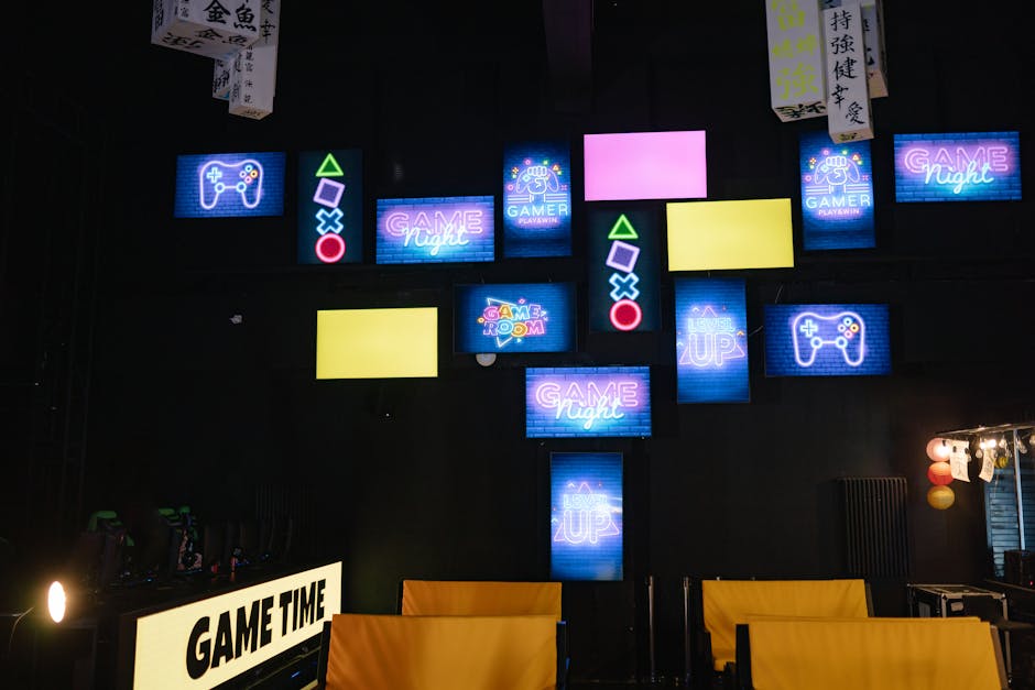
Remember to obsess over typography matching, construct menu systems that breathe the same air as your game environment, and polish even compliance or social components to blend seamlessly. Design is storytelling, and your UI is the chapter that holds the player’s hand through your world.
Next time you test your game, try stepping back and examining your UI with fresh eyes: does it speak the same visual language as your world art? If not, use these tips to bridge that gap, and you'll find your game feels more immersive, complete, and polished.
Happy designing!